Design system
A token-driven design system that gave WizCommerce a brand identity and one source of truth across commerce, CRM, and inventory.
Duration
Jun-Aug, 2026
Product
Wizcommerce
Role and Team
Me, Fellow Product Designer Design Lead
Services
#
Design Systems

What is WizCommerce?
WizCommerce is a B2B wholesale commerce platform used by sales reps writing orders on the road, showroom staff building carts, and back-office teams managing quotes, inventory, and customer records. It's a product that's often demoed live to buyers in showrooms and at trade shows — so how it looks and holds together is a commercial signal, not a cosmetic one.
The catch: the product had grown surface by surface, with no shared visual language. Every module had been designed in its own context, so the same concept looked different depending on which screen you were on
How It Started
Starting Out
The work began as a routine UI pass, but reviewing the live app surface by surface surfaced something larger: the same button, the same status, the same dropdown all rendered differently depending on the module. Spacing was eyeballed, text sizes were hand-typed, and no two modules quite agreed with each other.
Identifying the Root Cause
These weren't isolated mistakes — they were symptoms of a workflow gap. Designers worked in Figma; engineers built on MUI v5; nothing connected the two. There was no single source of truth, so every implementation involved a developer re-deriving values by inspecting a mockup and guessing when it was ambiguous. Drift wasn't a discipline problem; it was a structural one.
Deeper Look
Mapping how elements were created, implemented, and updated made the real cost visible: the product had no identity of its own. Screens read as generic enterprise software that could have belonged to any of a hundred B2B tools. For a product demoed live to buyers, that anonymity was the problem worth solving — and it could only be solved from the foundations up.

Problem
What the audit of the live product actually surfaced:
No brand identity in the product
No typographic voice, no considered colour relationship — nothing that made a screenshot recognisably WizCommerce.
Component drift across modules
Buttons differed in height, radius, and padding between the cart and the CRM. Spacing and type were set by hand each time.
Duplicate components with no real difference
Three separate dropdown selectors were doing the same job in three different modules.
Inconsistent status language
"Out of stock" was communicated three different ways on three different pages — different colours, placements, and wording.
No handoff contract
Engineers built on MUI v5; designers worked in Figma; nothing connected them. Every implementation was interpretation.
No edge cases, no responsive system
Not a single empty, loading, or error state existed — every screen assumed happy-path data. And desktop and mobile values were unrelated numbers, not a defined relationship.
Solution
The build order followed the dependency chain: foundations first, because everything else inherits from them.
Audit
I catalogued every distinct UI element across product listing, PDP, cart, checkout, and order management, documenting each inconsistency against the page it appeared on. That catalogue became the problem list above and set the sequence for everything that followed.
Research & benchmarking
I studied how mature systems structure themselves — Shopify Polaris, IBM Carbon, GitHub Primer, Atlassian, and Salesforce Lightning — specifically for how they separate raw values from semantic ones and how they tier components. I also worked from the engineering constraint inward: because the team builds on MUI v5, the component API had to map cleanly onto MUI's props rather than fight them.
A standardized workflow
I defined one path every design decision travels, so the system stays connected to code end to end:
Foundations — a two-tier token architecture.
Brand identity — a deliberate visual voice, built on those tokens.
Components — atoms → molecules → organisms, instance-first.
Surfaces — real product screens assembled entirely from system instances.
Handoff — a token-to-MUI contract engineers transcribe rather than interpret.
Governance — the mechanisms that keep the system alive after handover.

Foundations {Token Architecture}
275 variables across four collections.
Primitives (99) hold raw values with no opinion about use — color/orange/500, spacing/4, shape/radius/md. Seven colour ramps at ten steps each.
Semantic (72) hold intent, aliased to primitives — palette/primary/main, palette/text/secondary, palette/border/focus. Components bind only to semantic tokens, never to primitives.
That indirection is the whole point. A rebrand, dark mode, or a tenant theme means repointing ~72 aliases — not auditing 949 components.
Typography (47) and Spacing & Grid (57) use Figma Modes instead of duplicate token sets — the mechanism that later makes the whole product responsive (see below).
One deliberate constraint: zero paint styles. All colour flows through variables. Paint styles can't alias, can't carry modes, and can't participate in theming — allowing both would have created two competing sources of truth for the same value.
Brand Identity
Typography as the primary voice
RecifeText (serif) for headings, paired with General Sans for body and UI. B2B commerce software is overwhelmingly geometric sans-serif top to bottom; a serif display face gives WizCommerce an editorial warmth its competitors don't have, while General Sans keeps dense data screens legible down to 12px. [CONFIRM: was this pairing your call, or inherited from an existing brand guideline?]
Separating brand from signal
Orange became protected. It means WizCommerce action and nothing else. Every pairing was contrast-tested — palette/primary/on at 6.62:1 (AA), palette/success/dark at 8.45:1 (AAA). Purple (#8A2FC8) as secondary, teal as informational, and a ten-step warm-neutral gray complete the palette.
Shape, elevation, motion, icons
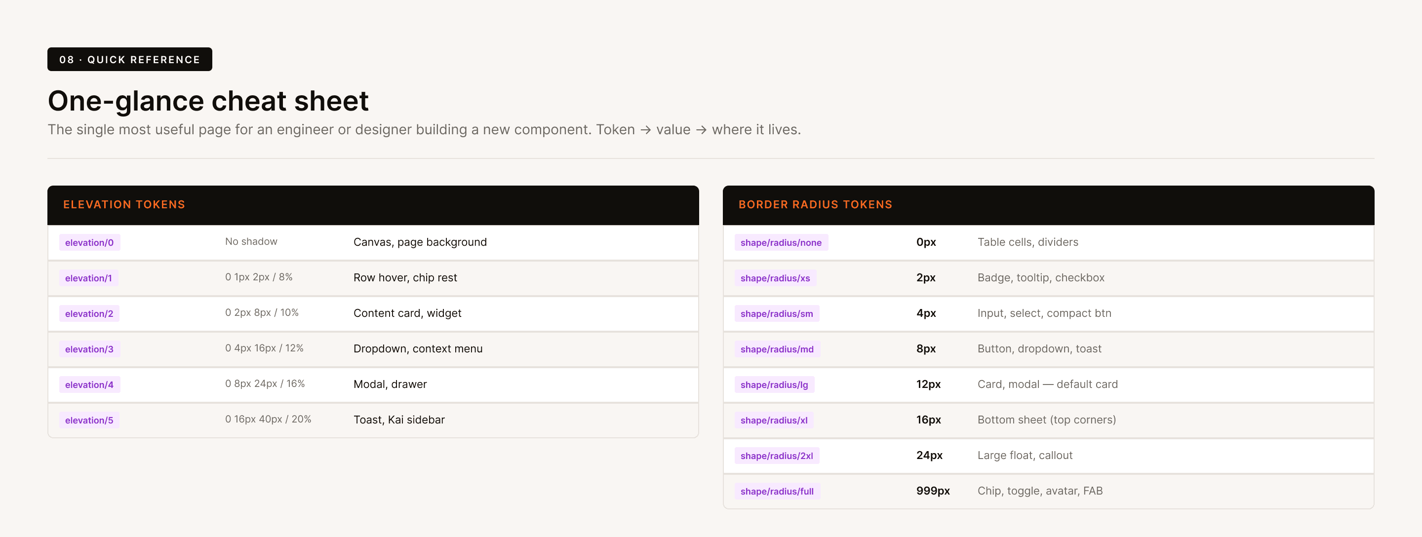
Eight radius steps on an 8px base. Six elevation levels. Fifteen motion tokens (six durations, five easing curves, four delays) so transitions are systemic rather than per-designer. Iconography standardised on Tabler at 24×24 with 1.5px stroke, shipped as a single 126-variant WizIconSet so swapping an icon is a dropdown change.

Components {Atoms → Molecules → Organisms}
Three tiers, one governing rule: instance-first — never recreate inline. A molecule is composed of atom instances; an organism of molecule instances. A fix at the atom propagates upward automatically.
16 atoms
WizButton — 72 variants across four styles (filled / outlined / text / tonal) × three sizes × four states, every fill and border token-bound, auto-layout set to stretch responsively. WizInput — 60 variants matched to MUI's TextField API, so a designer's variant selection maps 1:1 to a developer's props. WizBadge — 60 variants. WizImage — 156 variants (26 real products × four sizes across ten wholesale categories) so designers pick a genuine catalogue photo from a dropdown instead of dropping in a gray box.
11 molecules
Selectors, context menus, quantity steppers, search and filter controls. Where the audit found three overlapping dropdowns, I merged them into one WizSelector set — existing instances inherited the change automatically.
11+ organisms
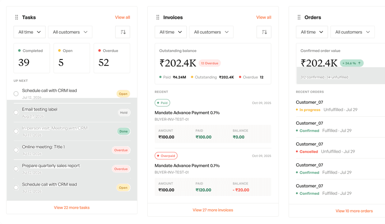
Product cards, cart rows, order summaries, data tables, navigation, filter panels, side sheets, Kanban boards.
Responsive System {Desktop, Tablet & Mobile}
Responsiveness isn't a separate library here — it's a property of the token. Because Typography and Spacing & Grid carry Figma Modes, the same token resolves to different values per device tier, and every component built from those tokens adapts automatically. No parallel mobile file, no duplicated components, no drift between breakpoints.
Desktop
The base tier. Spacing & Grid runs its widest scale and Typography resolves at full display size — display-xl renders at 64px — for data-dense screens like the Dashboard, CRM, and order tables where information density is the priority.
Tablet
Spacing & Grid carries a dedicated Tablet mode, so gutters, container widths, and spacing steps recompute for the mid-width canvas without any component being rebuilt. Layouts reflow from the same organisms — a product grid or cart simply inherits the tablet spacing scale. [CONFIRM: exact tablet breakpoint width]
Mobile
The tightest tier — built for sales reps writing orders on the road. Typography switches to its Mobile mode (the same display-xl token now resolves to 40px), and Spacing & Grid runs its compact scale, so touch targets, gutters, and type all shrink coherently from one source. A rep on a phone and a back-office user on desktop are looking at the same components, correctly sized for each.
Why this matters: responsive behaviour lives in the token layer, not in hand-tuned screens. Change the relationship once and it holds across all 13 surfaces on every device — the opposite of the old "desktop and mobile as unrelated numbers" problem.
Impact
A product identity that didn't exist before. Serif headings, a protected brand orange, a warm neutral base — a WizCommerce screenshot now reads as one product built by people who made choices.
Consistency became structural, not procedural. 949 components and 85,000+ instances all resolve to 72 semantic tokens. Drift is prevented by architecture rather than caught in review.
Handoff without translation. 194 mapped tokens turned implementation from interpretation into transcription.
Change became cheap. Dark mode, density modes, and tenant theming are mode additions rather than rebuilds — the architecture was designed for them from the first token.
Responsive by default. Desktop, Tablet, and Mobile all resolve from the same tokens, so every one of the 13 surfaces adapts across devices without a parallel build.
What's Next
The system works; it isn't finished. Documented gaps:
Documentation debt. Only a handful of component sets carry descriptions — a new designer still has to ask a person what
WizStatCardis for.Naming inconsistency in older layers. Sets named
Component 3,Dtype, andRowsurvive from the pre-convention era.Variant duplication. An audit of
WizProductCardfound 15 variants collapsing to 5 genuine configurations — the rest differed only in badge text, which should be a content override. I defined a badge taxonomy (success = In Stock, warning = Low Stock, error = Out of Stock, neutral = Pre-Order, info = New Arrival) and flagged the duplicates; the cleanup is outstanding.Edge cases. Empty, loading, and error states are in progress, not shipped.
Accessibility certification. Individual pairings are contrast-tested; a full WCAG AA pass across every component state hasn't been run.